Heartfelt hospitality in the District.

Home Sweet City is the highest-rated premium short-term rental management service in Washington, DC, with almost 100 carefully curated properties and a reputation for exceptional service. The company has grown and evolved since its founding in 2009, and with this positive momentum came the opportunity to redefine the visual brand to better match the company’s culture and values. Owners Lara and Alex asked us to create a new logo and brand identity based on a comprehensive brand strategy document provided by IX (Nine). Building on this foundation, we designed an identity that embodies the brand’s DC roots and its focus on delighting guests through a personal touch.
Visual Inspiration
After collaborating with the client on a creative brief that defined the company’s goals, its current and desired audiences, and its brand personality, we began the process of logo exploration. Because Home Sweet City only manages properties in Washington, DC, the fabric of the city itself was a focus. Iconic buildings, the textures of neoclassical architecture, and the patterns of the city’s streets helped us craft the logo concepts.

Logo Build
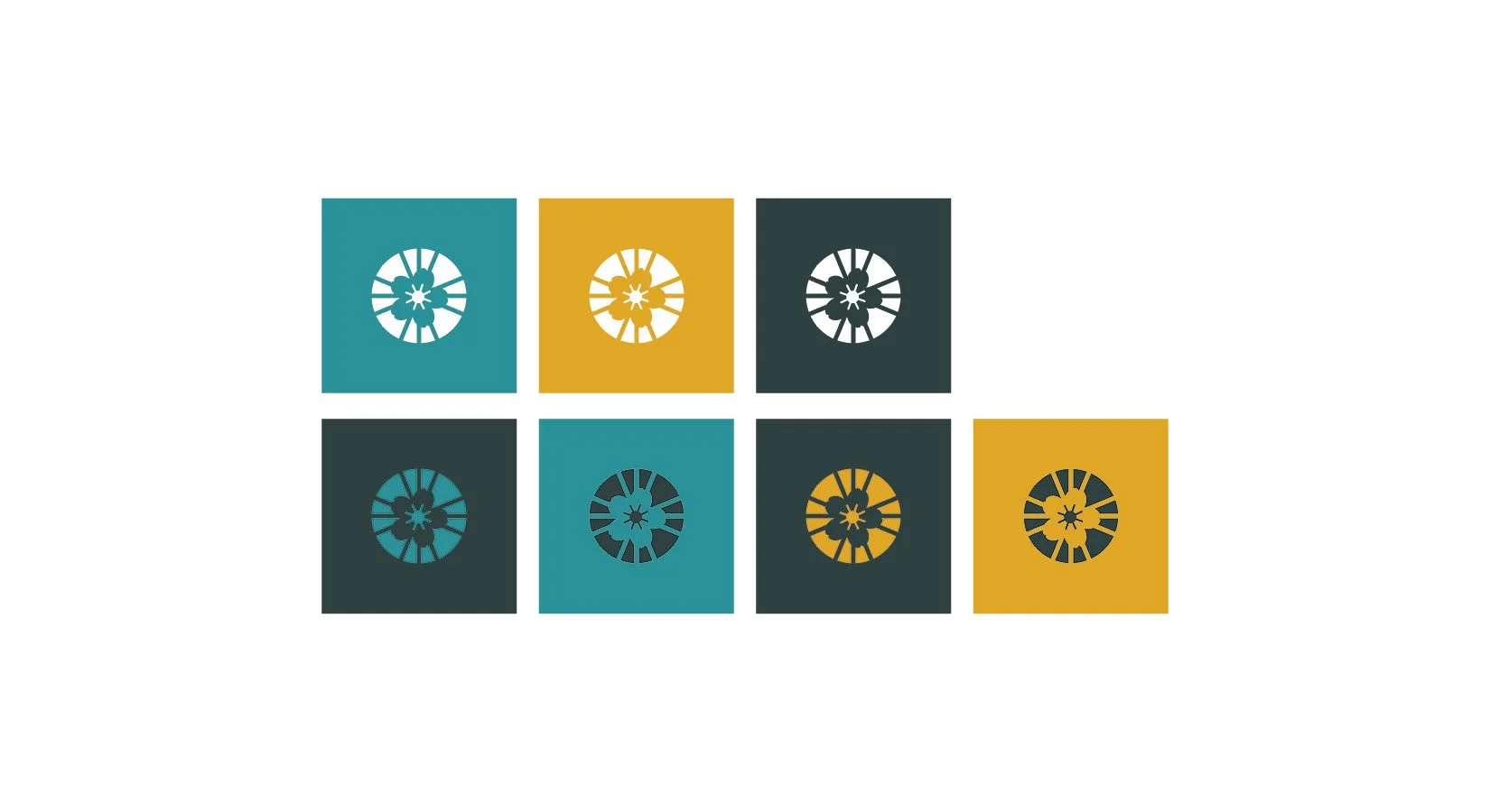
While we presented multiple logo concepts to the client, the one that resonated with them the most was derived from an 1874 map of the District and a well-known symbol of the city. We focused on an area of the map in which several roads converged at a central point, creating a shape that radiated out from the center. Placing this shape inside a circle gave it focus and a visual pull inwards, reflecting an important aspect of the brand archetype. Incorporating an iconic natural symbol of D.C.—the cherry blossom in simplified form—hinted at the location, while a subtle clockwise rotation of the inner elements added a touch of playfulness. The final logo mark balances elegance and friendliness; a fine match for a family-run company with high standards for quality.
In the full logo, the charming mark is paired with lowercase type for a friendly feel. However, the contrast in the letterforms lends the company name an effortless elegance. The soft motion suggested by the background shapes evokes a feeling of comfort and safety, supporting Home Sweet City’s mission and culture.
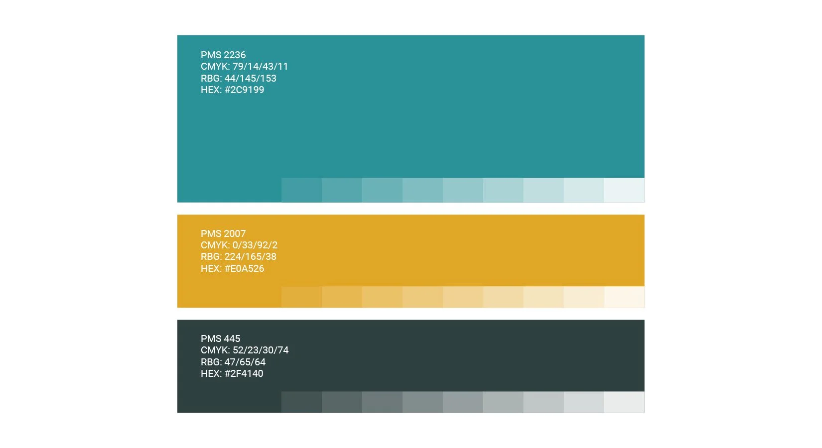
Primary and secondary color palettes and typographic styles were the next steps in forming the complete brand identity. The primary palette of three colors is calming and pleasant, with a gold accent providing a hint of luxury. This palette also lends itself to a number of color combinations that allow for variety within the brand system.
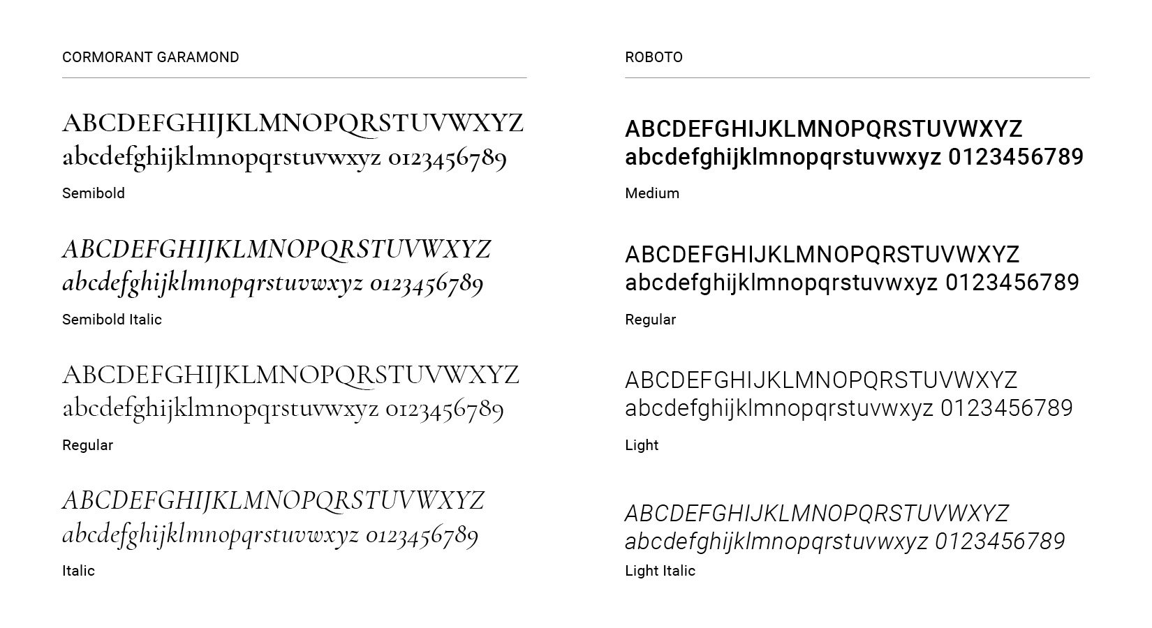
The brand fonts combine an elegant serif and versatile sans serif for contrast.
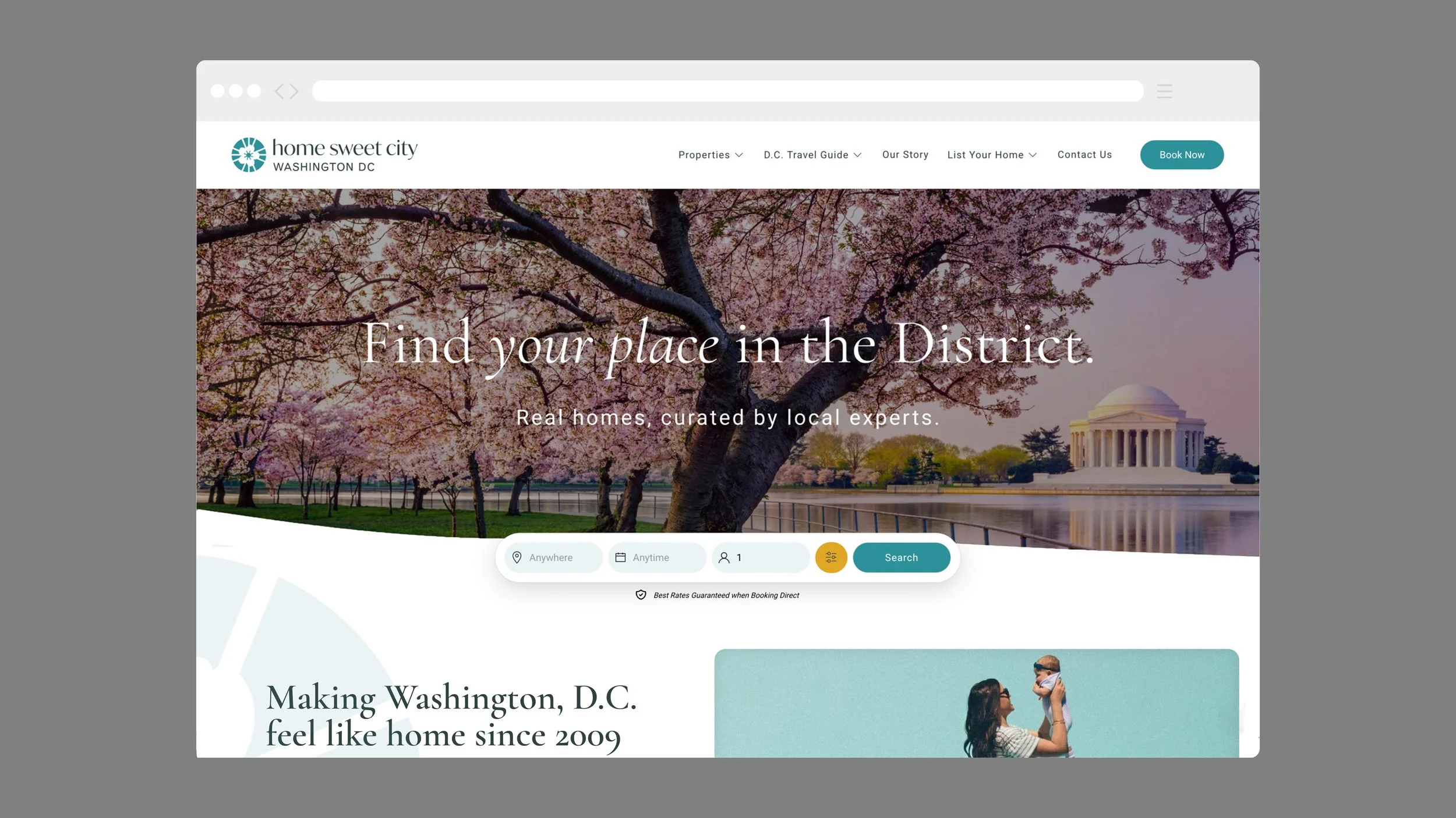
Website Visual Design
Redesigning Home Sweet City’s website was the most immediate application of the new brand identity. Since the company received the majority of their reservations through platforms like Airbnb and VRBO, they sought out a web development company that specializes in direct booking websites. We created visual designs for a few pages to act as a template for the developer so that the logo, colors, and typography would be used in an appropriate way throughout the site to engage and delight potential guests. The brand mark became a supergraphic that incorporated subtle animations to give the sight a playful feel.
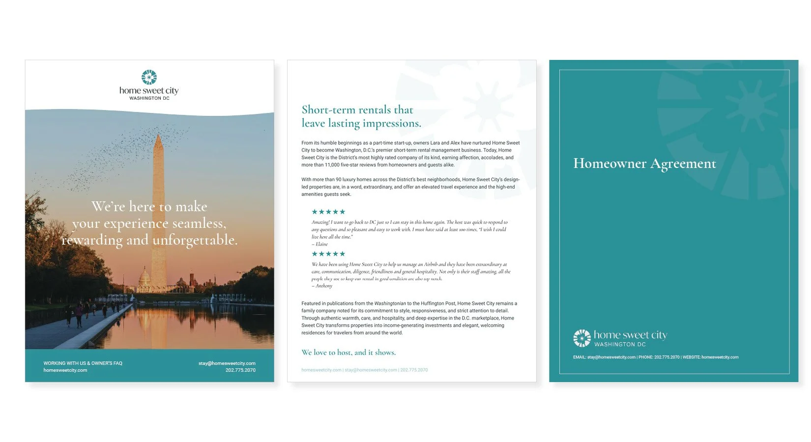
Branded Materials
Refreshing a brand means redesigning all print and digital materials, from email signatures to in-room signage. We worked with a copywriter to fine tune the company's messaging for both guests and homeowners, and we continue to work with the Home Sweet City team to provide sales presentations, business cards, legal documents, informational flyers, stationery, digital letterhead, and more. All with a consistent look and tone.