Waterperry Farm: Refreshing a Brand
Waterperry Farm is a hundred-acre property in Free Union, Virginia, featuring ten acres of English-style gardens. When the owner completed two new luxury guesthouses, she wanted to refresh her branding to represent both the accommodations and the established gardens. In order to appeal to overnight visitors, the brand needed to evolve to meet this new audience. We used elements from the existing logo and gave them a clean, modern update, introducing a new color palette and creating a suite of print pieces including business cards, stationery and notepads. Next, we organized a photo shoot to capture the guesthouses inside and out. Finally, we created an elegant website that features the fabulous gardens, opportunities for photo sessions, and the spacious, welcoming guesthouses.
Brand Identity
The first step in this process was to perform an audit of the existing brand elements and determine how they might be adapted into the new branding. The existing logo–focused solely on the gardens–was a bit complicated, with a floral motif and feminine color palette:

Simplifying the logo and making the color palette more neutral would bring sophistication and a modern look to the branding. As we began sketching ideas, we decided to keep the form of the W in “Waterperry” as a design element. On its own, the letterform was elegant and put us in mind of climbing vines, a reference to the surrounding gardens and bucolic landscape. We also noticed during a visit to the property that there was a beautiful iron gate with this same W integrated into the design.

By keeping this letterform we could maintain an element of the existing logo, while also referencing a physical feature that guests would see when visiting. Here is the resulting logo that combines the graceful letterform with clean, refined typography:

After designing the logo we turned to the color palette and typography. A muted green that is part of the color scheme in the guesthouses became the primary brand color, with a neutral pink and warm brown tones completing the palette. These colors impart a peaceful, natural feel, and complement the interior design of the guesthouses. The typography combines a striking serif and a easily readable sans serif to create contrast between headlines and body copy.

Once this “kit of parts” was established, we designed a variety of print materials using the brand colors, typefaces, and the form of the W as a graphic element. Business cards featured a large W that escaped the boundaries of the card to wrap from front to back, while notecards featured a seamless pattern of small Ws on a green background. Folded cards for use in guest rooms were decorated with the swirls and swashes of an oversized W.
Architectural Photography
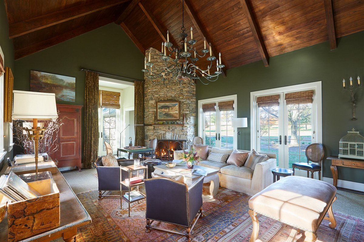
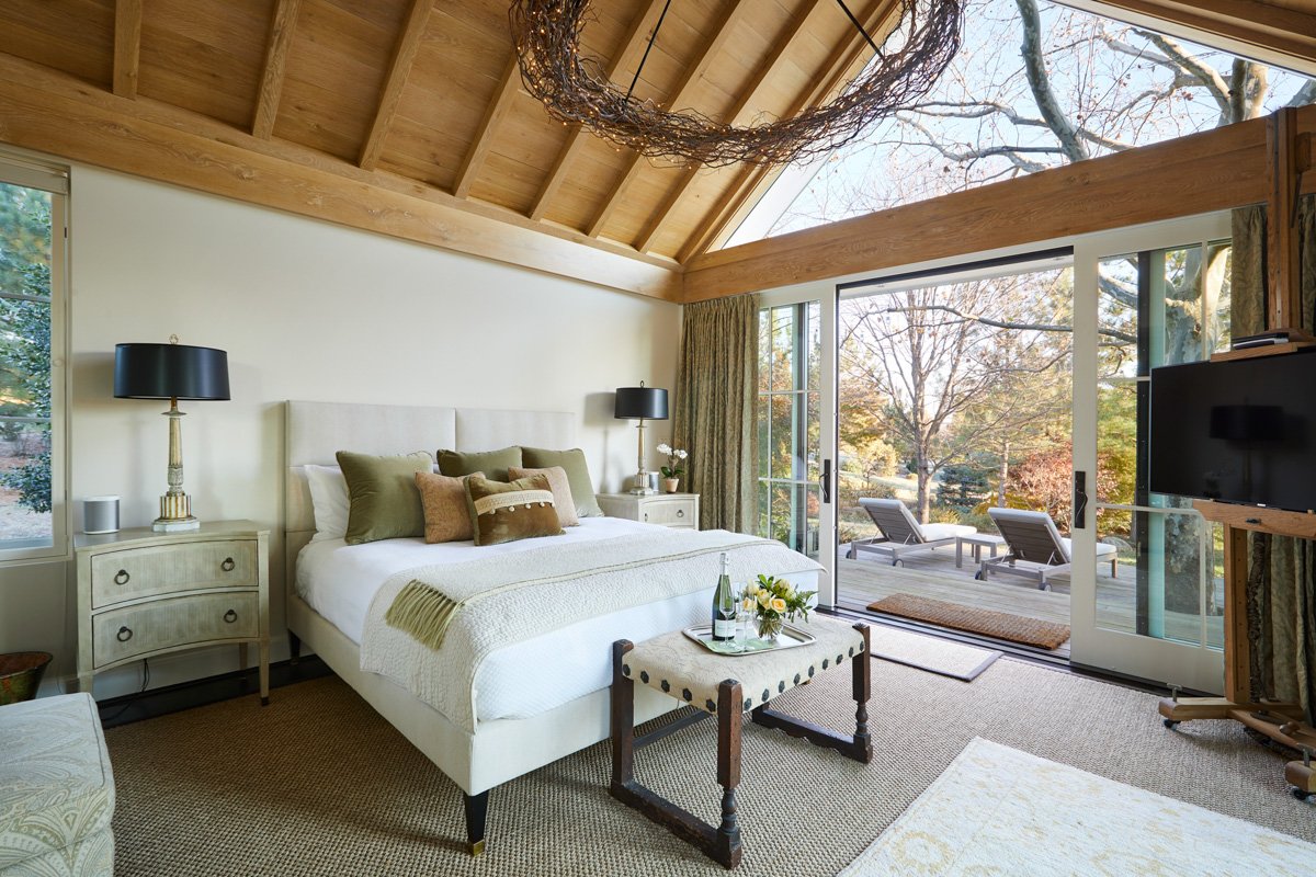
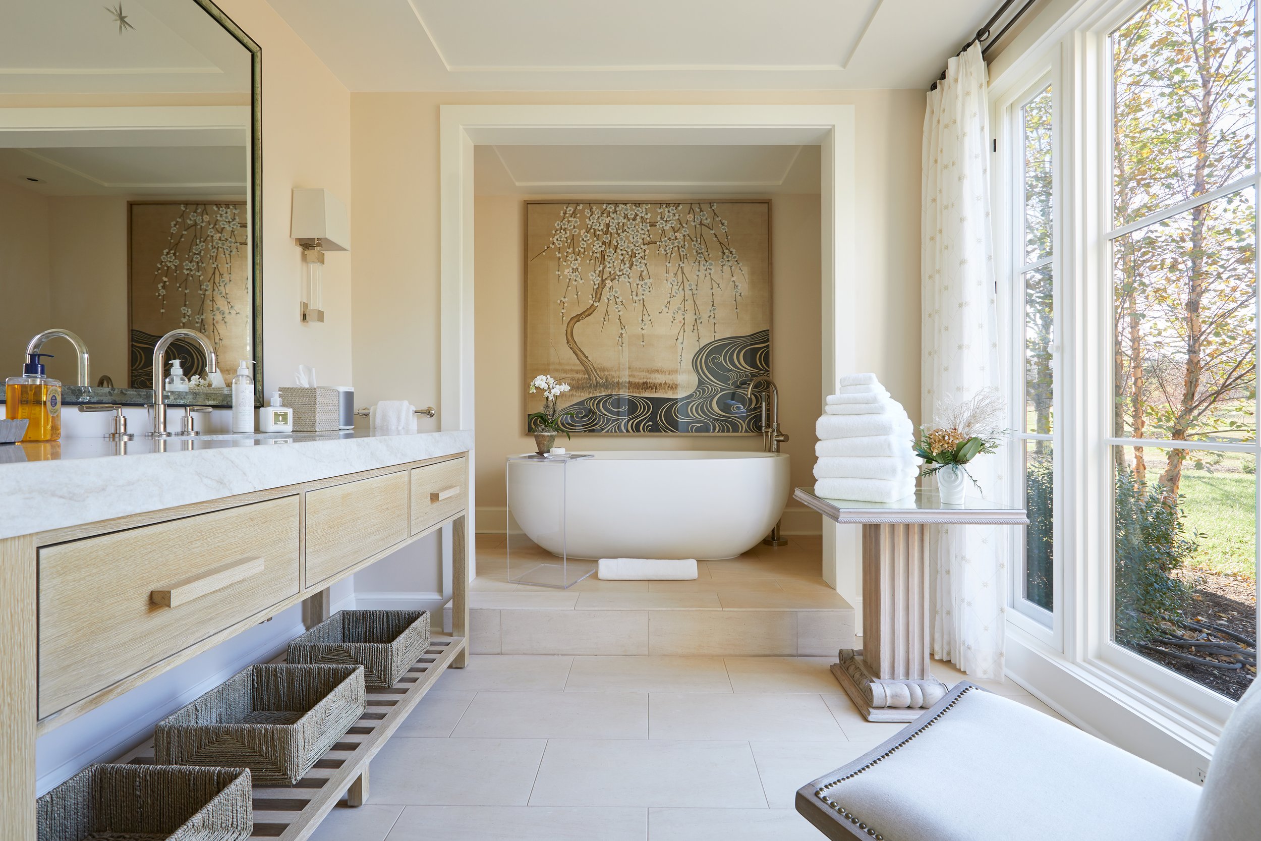
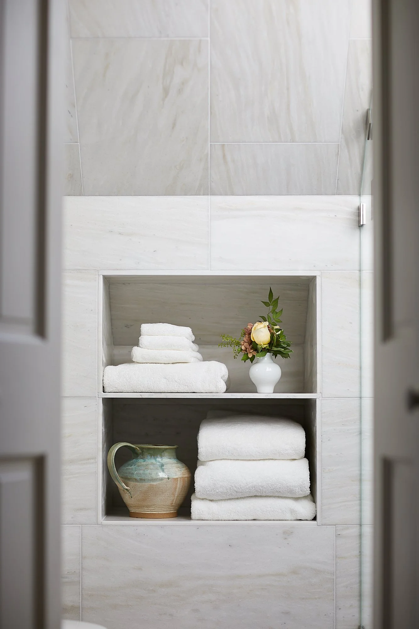
Because the guesthouses were newly built, we had to capture all the imagery for use in branding materials and on the new website. Over two long days we photographed each room in the Carriage House and the Farmhouse, plus any small details that conveyed the feeling of staying in these beautiful, tastefully decorated spaces. We took advantage of the abundance of natural light and carefully framed each shot. As evening fell, we were able to photograph the brightly lit interior of the Carriage House master bedroom against the blue of the deepening night. With the large sliding doors open, we could show how the boundary between interior and exterior could be adjusted for guests who want to be immersed in nature.


Website Design
With dozens of photographs in hand, and refreshed branding, we were ready to design a new website that would represent both the gardens and the overnight accommodations. The existing site (see below) had been built with only the gardens in mind and had not been updated for some time, so this was a redesign from the ground up.

We created a sitemap of the new site’s content, black and white low-fi-wireframes to show the structure and elements of each page, and then hi-fi wireframes in full color to represent how each page would look in a web browser when developed. The header design is clean and minimal, with a prominent Book Now button, and our photography helps to draw the viewer into the atmosphere of the property. We worked closely with the owner, who wrote the site’s copy, and this collaboration resulted in an engaging site that expressed the spirit of Waterperry Farm.


The Result
A refreshed brand identity, new website, expansive photography, and printed materials helped Waterperry Farm establish itself as a destination for high-end stays, and a gorgeous backdrop for photo sessions and small events. The property was even runner-up in the 2024 Best of C-ville for Micro-Wedding Venue.


